A couple of weeks ago the scientific papers related to the Planck Satellite were released to the public. As somebody interested in cosmology, I immediately jumped to paper 16 in the series (Cosmological parameters) to find out if the Planck satellite had drastically changed the numbers that go into our models.
One number that jumped out to a lot of people was the Hubble parameter. According to Planck, the Hubble parameter is 68 km/s/Mpc, and the Planck paper contains a nice graph showing how their value stacks up against others in the literature:
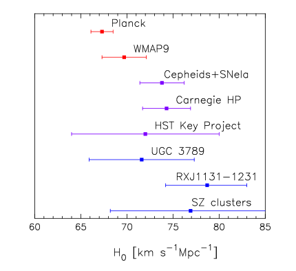
This figure, excerpted from Ade et al. (2013), shows recent measurements of the Hubble constant. The Planck measurement lies to the left of all of the other measurements, indicating that the Universe is expanding more slowly than we previously believed. The Planck datapoint is on the edge of the error bars of those given by a previous satellite that worked in the same way, but is clearly inconsistent with other measurements that use different techniques.
This graph inspired me to go searching for previous measurements of the Hubble constant. Thankfully I discovered this page, by John Huchra, which contains a carefully curated link to a text file full of all the measurements of the Hubble parameter up to 2010. Unfortunately I was unable to find a way to really get into the data beyond this plot:
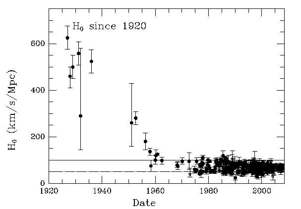
Here (again, borrowed from John Huchra’s page), is a graph of all the measurements of the Hubble constant through the years. This plot does its job perfectly, it illustrates that since 1920 our estimations of the Hubble constant have changed from “massively uncertain” to “it’s somewhere around 70 km/s/Mpc”. Unfortunately I Was unable to find another visualization that broke things down in more detail. As far as I can tell, this plot remains the best visualization of how our measurements of the Hubble parameter have evolved over time.
I hoped that given so much carefully collected data it would be possible to add to this work in a small way and so I set to work one weekend creating a fully interactive (zoomable, pannable, clickable) version of this graph, where the datapoints are colored by the method used to calculate them:
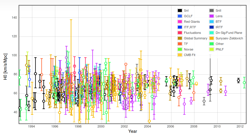
I hope this visualization is helpful in some way to somebody else. I have certainly enjoyed exploring it by myself: seeing how the systematic error bars on the measurements produced by each community have come down in time, or how different techniques started off with wildly different answers before converging towards the same result.