Divvy is Chicago’s Bike sharing scheme. For the past two years, Divvy has run a visualization competition, where they open source data on all of the trips from the previous year and invite people to build cool visualizations about that data. The entrants from 2014 are [here] (link removed because dead)
My friend Dan Platt and I decided to use the platform that we’re developing at Narrative Science, Quill – an AI platform that turns data into stories written in the English language – and interpret the structured Divvy data in the form of stories.
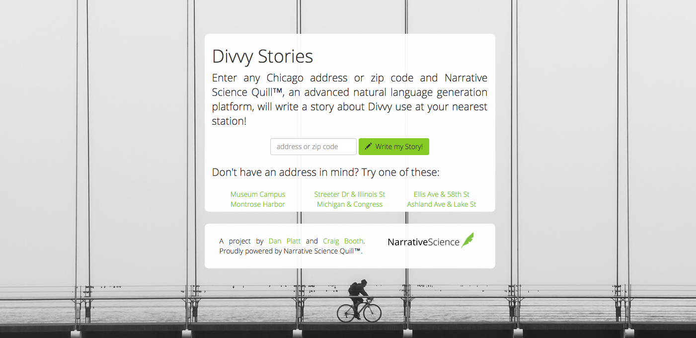
In designing the app we decided to build out a simple experience where the user enters a single piece of information about something that they have a personal link to – a place – and the app tells them something about Divvy use in that place that they may not already know. We did this by calculating the most interesting Divvy related facts about each station, and then comparing the properties of that station to others.

The first stage of building this app was to use Google’s GeoLocation API to translate any (Chicago) address input by a user into a latitude and longitude, and then look up the closest station.
Given the closest station, we take the dataset of 3 million Divvy rides from 2014 and combine it with data from other sources, including: weather data from Weather Underground, and Chicago neighborhood information from the City of Chicago’s Open Data Portal. We then calculate over thirty different metrics that describe each station, including:
- The fraction of trips taken in windy and/or hot weather
- The fraction of round trips (trips that start and end at the same station)
- The fraction of trips taken by subscribers
- The net inflow of bikes (because Divvy vans rebalance bikes, some stations have many more trips arrive at them than leave)
- The proportion of trips that end up in the same neighborhood as they started
- The amount of Divvy activity in the area (measured by the number of stations within one mile)
- The number of morning and evening commuters
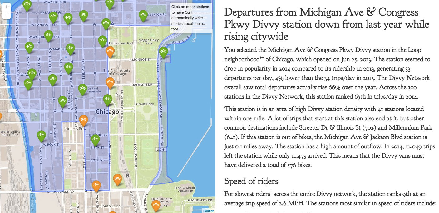
And we extract a sampling of up to five of the most interesting metrics. We then feed this information into Quill, which has been configured to transform it into stories, where for each of the interesting metric it calls out stations that are most similar, and most different in various ways.
In order to make the app more dynamic, we designed the left-side of the page to show a map of nearby Divvy stations, and the user can click around in the map and request that Quill writes more stories, interactively.

I really think that our app showcases the Divvy data in a unique way, and by using the English language, we’re able to communicate a lot of insight in a single page. You can try out the app here (link removed because dead)
We are finalists in the 2015 data challenge, in the Most Creative category.
Update: We won. Here is the page that was published in the Red Eye
