In my last solar post, I dug through twelve months of data from our brand-new array, marvelled at heat-maps of generation and consumption, and sketched a long-term plan to electrify the house. Eighteen months have slid by, and the spreadsheet has a whole lot more rows. time to plot, squint, and see what the second lap around the Sun actually looked like.
Important context: other than swapping a gas range for an induction cook-top last spring, nothing about the house or the system has changed. No extra panels, no batteries, no insulation blitz—just the same roof, the same Enphase API, and a slightly different way to boil water.
Self-Sufficiency, Month by Month
Share of our household electricity met by the solar array from January 2023 to May 2025; note the steep winter-to-spring climbs, late-summer dips, and the small post-induction nudge that keeps spring values just shy of 100 %.
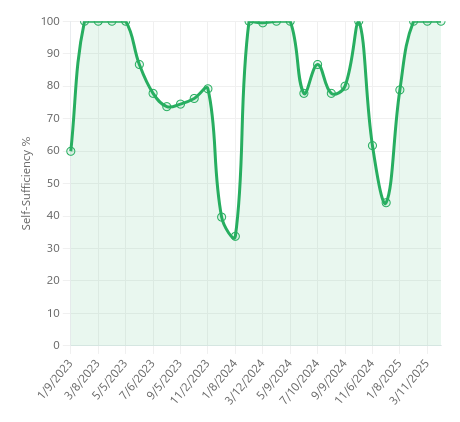
- Climbing out of winter. Like last year, our curve shoots from ~60 % in the darkest weeks to 100 % as soon as daylight and shoulder-season temperatures align.
- The mid-2023 dip. A soggy July–August knocked generation while the AC ran overtime. You can see the wobble down into the 70 % range.
Generation ↔ Consumption by Season
Average daily kilowatt-hours produced (orange) and used (red) through the year, illustrating a healthy spring surplus, near-parity in high summer, and the familiar winter shortfall when short days and extra heating tip the balance.
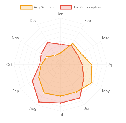
This chart shows some interesting seasonal trends:
- Spring (Apr–May): Generation outpaces demand by roughly a third—ideal “solar surplus” months.
- High summer (Jul–Aug): Long days but we use a lot of electricity as the HVAC + dehumidifier fight heat and humidity.
- Autumn shoulder (Sep–Oct): A tight squeeze, shorter days, but also our AC use begins to slow.
- Deep winter (Dec–Jan): The familiar crunch: short daylight, low-angle sun, holiday cooking, and little help from the roof.
What the Numbers Tell Me
A few interesting takeaways from this exercise:
- Seasonality still rules. Without storage the winter gap is unavoidable; even perfect efficiency can’t conjure photons in January.
- Incremental electrification is visible, but not catastrophic. The stove nudged consumption upward less than 100 kWh for the whole year—well within the spring surplus.
- Spring beats summer for generation: the radar chart shows our panels producing more power in April–May than in high summer—my hunch is that the lower spring sun hits the roof closer to 90°, letting each photon land square on target.
- More data beats intuition. I’d have guessed the new range would be a bigger hit, and that we would be generating more electricity int he summer. The plots say otherwise.
- Overall electricity use crept up ~4 % year-on-year, almost entirely attributable to the induction range.
Looking Ahead
For now we’ll keep gathering clean baseline data and let the system coast, adding neither batteries nor extra panels. If any of our remaining gas workhorses—the furnace, water heater, or dryer—happen to give up the ghost, their successors will be electric; until then, we’re content to let them live out their natural lifespans rather than sinking capital into premature upgrades.